Health and safety signs
Health and safety signs are used if there is a significant risk that cannot be avoided or controlled in any other way, or can provide information to supplement another form of control measure.
On this page
- Why should we use health and safety signs?
- Five main types of sign
- Specialist signs and signals
- Factors to consider
- Safety sign maintenance
Why should we use health and safety signs?
Health and safety signs should be provided and maintained in circumstances where there is a significant risk to health and safety that has not been removed or controlled by other methods.
This is only appropriate where the use of a sign can further reduce the risk. If the residual risk is not significant, there may be no need to provide a sign.
Five main types of sign
1. Prohibition
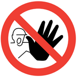
Use - A sign prohibiting behaviour likely to increase or cause danger.
Features - Circular shape, white background with black pictogram/text, red circle with diagonal line over pictogram
Example - No access for unauthorised persons
2. Warning

Use – A sign giving warning of a hazard or danger
Features – Triangular shape, yellow background
with black pictogram/text, black edging
Example – Caution wet floor
3. Mandatory

Use – A sign prescribing specific behaviour
Features – Circular shape, blue background with white pictogram/text
Example – Respiratory protection must be worn
4. Safe condition
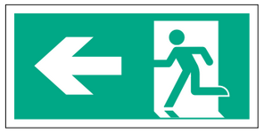
Use – A sign giving information on emergency exits, first aid, or rescue facilities
Features – Rectangular or square shape, green background with white pictogram/text
Example – Fire exit
5. Firefighting
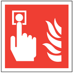
Use – A sign giving information on fire fighting equipment and fire alarm activation points
Features – Rectangular or square shape, red background with white pictogram/text
Example – Fire alarm call point
Specialist signs and signals
Other than the main types of signs, there are additional signals or specialist signs that can be used.
Illuminated sign
A transparent or translucent sign which is illuminated to give the appearance of a luminous surface. These signs can be used in the event visibility or mains lighting is impaired and critical safety information is still required to be seen (e.g. fire exit).
Acoustic signal
A sound signal which is transmitted without the use of a human or artificial voice (e.g. a fire alarm).
Verbal communication
A predetermined spoken message communicated by a human or artificial voice (e.g. public address system).
Hand signal
A movement or position of the arms or hands giving a recognised signal and guiding people who are carrying out manoeuvres which are a hazard or danger to people (e.g. vehicle banksman).
Warning light
A visual signal which gives warning to a hazard or emergency situation, usually in conjunction with an acoustic signal (e.g. flashing lights with a fire alarm in a hearing protection zone).
Exit instructions
A instruction on how to operate a fire exit or other final building exit (e.g. ‘push bar to open’).
Factors to consider
It is important that safety signs and signals are used effectively to ensure the message they convey is clear and concise.
Impact
The aim is for minimal signage for maximum impact. If too many signs are placed together, there is a danger of confusion or important information being overlooked. This is referred to as ‘sign blind’.
Combinations
In some cases, more than one type of safety sign or signal may be necessary (e.g. warning light on a forklift truck as well as hand signals from a banksman).
Temporarily impaired senses
If the hearing or sight of any employee is impaired, for example by wearing PPE, additional measures should be taken to ensure that employees can see or hear the sign or signal (e.g. increasing the volume).
Long-term impaired senses
If the hearing or sight of any employee is impaired long-term or permanently, then a combination of measures may be required if the risk is significant (e.g. for emergency procedures).
Target audience
The sign should be the appropriate size and siting for the target audience (e.g. signs aimed at a delivery driver should be large enough and at the correct height to see from the seat of their vehicle).
Changes of direction
If signage is giving instruction when entering a new area or changing direction on a walkway, the signage should be positioned so that it is clearly visible before entering the new area or changing direction.
Language barriers
Staff, students and visitors on UCL campus may not have English as a first language. Health and safety signs are universal, so ensuring that any signs used are within the parameters of the five main types of sign, they should be easily understood by everyone on campus. Avoid using too much text or complex instructions on signs.
Aesthetics
To be pleasing on the eye, signs should line up with windows and doors and other building features. For example, the top of the sign can be aligned with the top of the window or bottom of the sign with the bottom of the window.
Consistency
Signage is most effective when it is consistent. Use of the same colours, warning symbols, company branding etc. all makes for a consistent look and ensures the message is clear. If new signs are being put in place, all old, weary, redundant signage should be removed to make the new signage effective.
Safety sign maintenance
All safety signs must be properly maintained so that they are capable of performing the function for which they are intended. This can range from the routine cleaning of signboards to regular checks of illuminated signs and testing of acoustic signals to see that they work properly.
All safety signs should maintain their features under power failure – either from emergency lighting or phosphorescent material – unless the hazard itself is eliminated by the power failure.
Last updated: Friday, February 19, 2021
 Close
Close


