CO2 emissions for every ship for every hour, now that's big data!
19 April 2016

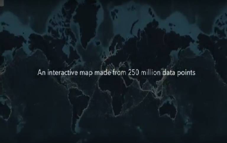
Researchers at UCL Energy Institute use the methodology they developed for the Third IMO GHG Study 2014 and AIS data to estimate emissions from five different ship types and display this in a new interactive map that plots 250 million data points to show the movements of the world’s commercial shipping fleet over the course of the year 2012.
The interactive shipping map has been developed by the UCL Energy Institute and London-based data visualisation and digital journalism studio Kiln, and was funded by the European Climate Foundation. It is based on hundreds of millions of individually recorded ship positions; plotting all of these at once shows the extraordinary extent of modern shipping’s reach.
Based only on ship movements and without a background map, the world’s coastlines are clearly defined, with plenty of variation in ship activity: from the buzz of activity in the East China Sea to the relative quiet of Somalia’s piracy afflicted waters to ship movements in areas where one might not expect them, such as the Arctic and Antarctic. The map also clearly shows the most crucial shipping thoroughfares of all: the canals linking different bodies of water, such as the Panama Canal, opened a century ago to connect the Atlantic and Pacific Ocean, and the even older and busier Suez Canal which saw 17,000 transits in 2012 alone.
To observe the flows of the global economy in more detail, users can distinguish between five different ship types; container ships, tankers, dry bulk, gas bulk and vehicle carriers. The map for example illustrates the movements of tankers which ship oil from massive terminals in the Middle East or from offshore rigs in West Africa and elsewhere, dry bulk carriers moving aggregates, ores and coal from mines and quarries, many of which are found in Australia and Latin America. Many of these raw materials are shipped to manufacturing regions to make finished goods which are themselves moved back across the ocean in container ships.
UCL-Energy researchers took AIS data showing location and speed of ships and cross-checked it with another database on vessel characteristics, such as engine type and hull measurements. Using this information, they were able to compute the CO2 emissions for each observed hour, following the approach laid out in the Third IMO Greenhouse Gas Study 2014. Kiln took the resulting dataset and visualised it with WebGL on top of a specially created base map, which shows bathymetry (ocean depth) as well as continents and major rivers.
For each ship type as well as for the entire global fleet, the map displays the freight carried and CO2 emitted by the ships. Emissions from international shipping for 2012 were estimated to be 796 million tonnes CO2 which is more than the whole of the UK, Canada or Brazil emit in a year. This number can be further broken down into 2.18 million tonnes CO2 per day or 90,868 tonnes CO2 per hour.
To view the interactive map and explore the movements of the global fleet, please visit www.shipmap.org
Since shipmap.org went live in April, it has made over 100k twitter impressions and has been tweeted about all over the world, including a direct tweet from Bill Gates.
This interactive visualisation has been picked up by a number of international media sources including The Guardian, The Sydney Morning Herald and VOX.
In the media:
- The Guardian: The eco guide to cargo ships
- The Sydney Morning Herald: From pirates to power plays, interactive map shows how Australia relies on ships
- Daily Mail: Watch cargo ships sail Earth's oceans: Hypnotic interactive map follows the route of giant vessels over a year
- VOX: This Map Tracks Thousands of Cargo Ships to Highlight Their Carbon Emissions
- China Dialogue: Growing coalition pushes for cap on CO2 emissions from ships
- Motherboard: This Map Tracks Thousands of Cargo Ships to Highlight Their Carbon Emissions
- City Metric: This data visualisation shows the path of every trade ship in the world over the course of 2012
- gCaptain: This Mesmerizing Interactive Map Displays Ship Movements Across the Globe
- The Maritime Executive: Video Roundup: Animated AIS, Petrobras on Netflix
- ClimateHome: US, China resist shipping emissions curbs at UN meet
- allaboutshipping.co.uk: University College London launches interactive shipping map
- Ship Efficiency Review: Interactive Map Plots Per Hour Ship Emissions
- Carbon Brief Video: Maritime experts on the need to reduce shipping emissions
- The Shipping Podcast: The Shipping Podcast - Featuring Tristan Smith
- Fast Co Design Mapping: The Stunning Complexity Of The World's Shipping Routes
 Close
Close

