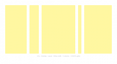
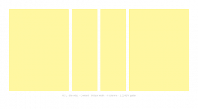
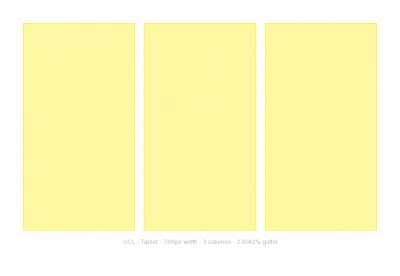
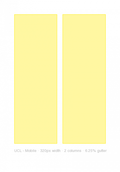
UCL uses a simple five column asymmetric grid for creating interesting and dynamic layouts for desktop. The grid at smaller sizes - tablet and small screen - reverts to a three and two column symmetric grid.
All grids are fluid and capped with a max width. This will enable fixed-width layouts if required.
View a demo file of the UCL grid.
Download all UCL Grid assets Includes: CSS, PNG, Sass functions.
Desktop
Desktop grid A

Desktop grid B

Table

Small screen

 Close
Close

