A statement from the artist, Sarah Fortais.
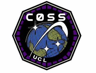
The COSS patch was designed by COSS artist-in-residence Sarah Fortais. She explains her design below:

Generally, there exists a pretty standard anti-clockwise rotation of satellites and objects orbiting earth, but by choosing an 'upsidedown' or South upward depiction of earth in the logo, it gives the initial impression that the 'orbiting swoosh' I drew is going backwards. I like that it might make someone reconsider the visual language we use to think about earth and who might be benefiting from standardizing its depiction.
The earth is hand drawn instead of photographic in order to emphasize a subjective, human perspective of earth and remove any particular reference to a season or piece of space imaging technology. Personally, it makes me think of the whole earth (maybe along the lines of The Whole Earth Catalog) instead of trying to squint and see if I can see my home town.
The three stars are simply different opinions or perspectives or landing sites. I attempted to reference a nautical star, a retro space mission star, and also what it looks like to squint at fairy lights from a distance.
The retro font was chosen to complement the hand-drawn earth; that in itself is consistent with early space mission patches which were often drawn by hand, but I also enjoy the more general sense of nostalgia for early science fiction that the logo might conjure up. In my opinion, using familiar imagery to touch on the notion of shared speculative science fiction and space culture is one possible way to subvert grand dystopian narratives of colonizing space dictated from narrow economic sources, and keep the future of space exploration communal.
Overall, the approach to creating the logo attempts to emphasize our shared and human relationship to earth and space, which is just another way of expressing the COSS mission.
 Close
Close

