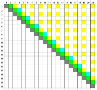
These materials support the experiments described recently in a paper submitted to Psychology of Aesthetics, Creativity and the Arts. That paper described a paired comparison study in which subjects saw various paired comparisons of 21 different rectangles, from very tall and thin, through the square, to very wide and flat. With a full paired comparison design there would be 21 x 20 /2 = 210 unique combinations, which is too large to be practical. Instead a set of 84 comparisons is presented, which has the advantage of sampling the entire range and yet also providing detailed information on closely similar rectangles. The design matrix is shown here, and it should be noted that:
- The yellow squares in the design matrix provide a complete paired comparison design for the 11 odd-numbered rectangles;
- In addition the design provides comparisons of all rectangles which are one step apart (the green squares in the matrix); and,
- The blue squares in the design matrix provide comparisons of all even-numbered rectangles that are two steps apart.
The 84 paired comparisons therefore provide an efficient method of sampling the entire rectangle space, while at the same time allowing focus on closely similar rectangles.
Statistical analysis. Conventional analysis of paired comparison designs relies on summing across the columns of a complete paired comparison design. The design here is best analysed by means of a regression model approach in which 20 dummy variables, coded as 0 or 1, allow comparison of the preference of that stimulus with an arbitrarily chosen reference rectangle. Further technical details are provided here. There are also two Excel files, one for 84 rectangle pairs, and the other for 168 rectangle pairs, the columns of which show the details of each rectangle in each of the stimuli. An SPSS syntax file shows how to analyse the 84 or 168 long Excel files, and also describes the coding of the 6-point preference judgements.
The rectangles. We wished to sample a wide range of rectangle space, both vertical and horizontal, and yet also include the two Golden Section rectangles, since historically these have been of interest in this research area. A detailed description of the rectangles used is provided here, along with a Monte Carlo analysis of the number of circular triads to be expected by chance alone in this design.
Stimuli
Stimuli for the experiment are provided below, in three different formats. Each image is of size 1024 x 768 pixels. The two rectangles each have an area of 20,000 pixels, and are centred vertically, and are placed horizontally so that the horizontal distance between their inside edges is 200 pixels.
Images are provided as PNG files, which have the advantage of being both compact and also lossless, which is useful for images of solid colour.
Each image has a number at the bottom centre which is sufficiently feint to mean that it is barely visible when a subject is looking at the rectangles, but is visible enough to the experimenter to mean that the images will not be presented in the wrong order.
Each zip file contains 168 images, numbered from 1 to 168, so that the stimuli may be presented twice in their entirety in order to assess test-retest reliability. If that is not required, then only the first 84 images should be presented.
The three sets of stimuli are:
| Black rectangles on a white background. These images are designed for printing as part of a pencil-and-paper version of the test. The zip file contains 168 images, of which the second 84 are a repeat of the first 84 but with appropriate numbers. A powerpoint version (1.4 Mb) of the first 84 images is also available which is suitable for printing; this file also has three practice images at the beginning. |  |
| White rectangles on a black background. These images are designed for incorporating into a computer display. The zip file contains 168 images, with the second 84 repetitions of the first 84 but with appropriate numbers. Experience suggests these images are suitable for projecting in a lecture theatre or other room with moderate levels of background lighting. |  |
| Grey rectangles on a black background. These are similar to the images above, except that the zip file contains rectangles which are mid-grey (128) and are more suitable for projecting on an individual computer-screen in a darkened room, when the white on black have too much glare. |  |
 Close
Close

