14 Some simple graph scripts
14.1 Introduction
Stata graphing is easy if you use the interactive graph editor.
Stata graphing is hard if you script. The documentation is exhaustive and highly structured. And a complete rabbit hole. The cheatsheet is a great help!
You should script because graphs that are scripted are
- repeatable;
- modifiable;
- programmatically exportable to Word, HTML and so on.
The problem is remembering both the huge variety of options available (1,700?) to what are at base a small number of basic graphing commands, and knowing which options can apply to which graph types. I haven’t mastered either of these issues.
The cheat sheets really help.
https://www.dropbox.com/s/689lovb5vf5meyt/statacheatsheets.pdf?dl=0
Instead, I want to show you some simpler and then some slightly more complicated graph scripts with explanations of the options and then explain how to export your output to reports.
14.2 What will you learn?
We will cover some basic graph editing using the graph editor/menus, just to get an idea of what Stata graphs can look like and some of the options we can change.
We will then cover creating and modifying graphs in scripts including adding adornment to graphs, such as titles, subtitles, notes and captions, modifiying appearance such as the shape and colour of markers and using by(), over() and separate to produce facted and subplots and to selectively modify graph objects. You will also be introduced to the very basics of Stata’s graph schemes.
Finally you will learn the effective way to export graphs from scripts to Word documents and how to create several graphs and export them in a script loop.
So, first, we will look at using the graph editor to understand the alternative to scripting.
14.3 Exercise
Import the data from
https://www.ucl.ac.uk/~ccaajim/medtrial.csv"using the Stata procedure import delimited.
Use the following code to add value labels to the variable gender:
 label define genderl 1 "Male" 2 "Female"
 label values gender genderl
Use the commands desc and codebook to examine the data set.
Use the Stata grahics menu to make the following plots:
- a pie chart of frequencies of
gender - a bar chart of frequencies of
smoker - a histogram of
hbefore - a histogram of
hafterwith subplots bygender
For the last of these, with the graph window open, open the graph editor and change the colour of the bars (plotregion 1, plot 1) and the bar borders to reddish. Save the plot to a png file.
14.4 Basic types of Stata graph
- twoway plots
- scatterplots;
- line plots;
- fit plots;
- fit plots with confidence intervals;
- area plots;
- bar plots;
- range plots;
- distribution plots
- scatterplot matrices
- bar charts
- box plots
- dot plots
- pie charts
14.5 The basic graph command and some simple examples
The most basic command for creating graphs and charts in Stata is graph. This command has a number of sub-commands and options. The major sub-commands describe different varieties of plot - such as twoway, box plot, and the sub-types of twoway such as scatter and line. (For some reason there is also a small collection of graphs that are independent of either graph or twoway including histogram.)
14.6 Exercise
Create a new do file and add the following lines of code:
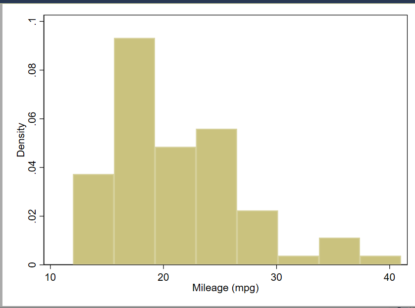
sysuse auto, clear
hist mpg
A simple histogram of the mpg variable from data set auto.
Open the graph editor and change the background colour of the graph.
14.7 Creating a graph adding elements and changing defaults: box plot example
Next an equally simple box plot:
graph box mpg

A box plot graph of the mpg variable from the auto data set with no options specified.
14.8 Exercise
Using the data in the file medtrial.csv on **https://www.ucl.ac.uk/~ccaajim/“, create a box plot of the variable hafter.
Use the option nooutsides to block the graphing of extreme values. Use your internet search power to find the documentation of the option nooutsides.
14.9 Adornments
This graph has no options specified. We begin by specifying a Title. When creating a graph from a script, it makes code easier to read if each option is on a separate line, and if we indent options. To break a command over more than one line in a Stata do file, we must use the line extender code: ///.
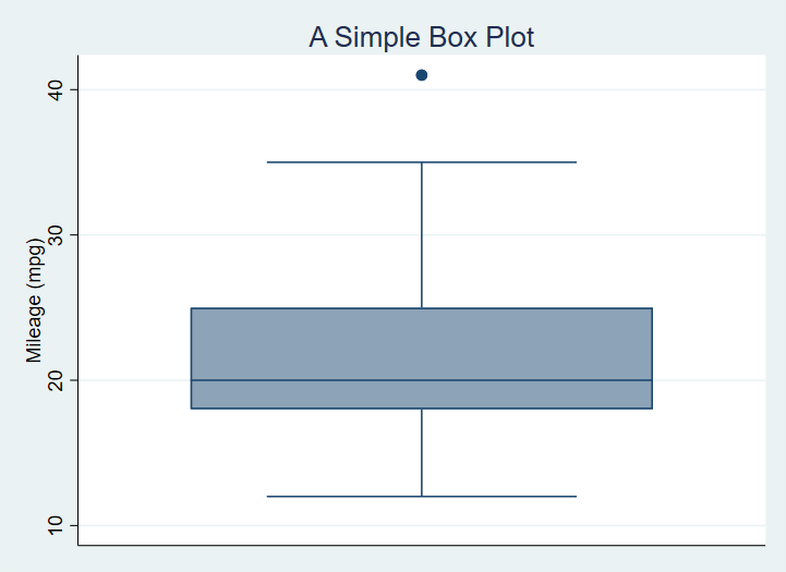
sysuse auto

graph box mpg, ///
  title("A Simple Box Plot")
A box plot graph of the mpg variable from the auto dataset with title added.
Now, we add a sub-title, caption and a note on the graph with instructions for position and ring:
sysuse auto

graph box mpg, ///
  title("A Simple Box Plot", position(12) ring(1)) ///
  subtitle("There is only one group in this graph.", ring(0)) ///
  note("In later graphs we will subset the data.") ///
  caption("This is the caption or our first graph.")
A Box Plot with Title, Subtitle and Note
The position option is a clock number and ring is 0 or 1, indicating inside or outside the plot region.
14.10 Exercise
Using the medtrial data set, create a box plot of each of hbefore and hafter.
Add to each the title “Plasma concentrations of H”, with the appropriate subtitle indicating whether the measure is pre or post treatment.
14.11 Subset the data
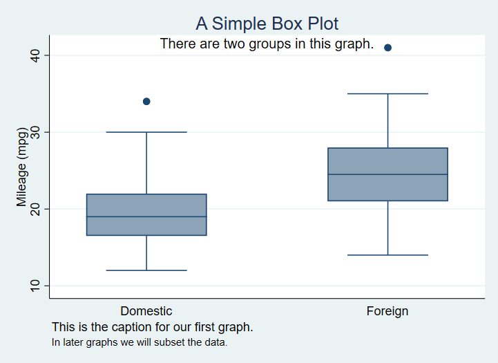
No we subset the data using the categorical variable foreign.
graph box mpg, ///
  title("A Box Plot", position(12) ring(1)) ///
  note("We have no subset the data.") ///
  caption("This is the caption for our first graph.", ring(1)) ///
  subtitle("There are two groups in this graph.", ring(0)) ///
  over(foreign)
Which produces9

A Box Plot with data grouped based on a nominal variable.
14.12 Exporting the graph to Word from your script
The following code creates a box plot with a variety of options set, and saves the output as part of a Word document also created by the script.
sysuse auto, replace
cd "c:\Users\DELL\Documents\Data\Stata\TablesTutorial\StataGraphing\"
putdocx clear
putdocx begin

// Create paragraphs
putdocx paragraph
putdocx text ("Create and embed your graph"), style(Heading1)
putdocx paragraph
putdocx text ("This is a graph created by a script and exported to Word.")

// Embed a graph
graph box mpg, ///
  title("A Simple Box Plot") ///
  subtitle("There are two groups in this graph.") ///
  over(foreign) ///
  asyvars ///
  graphregion(fcolor(gs13)) ///
  plotregion(fcolor(cranberry)) ///
  plotregion(icolor(ltblue))

graph export "C:\Users\DELL\Documents\Data\Stata\TablesTutorial\StataGraphing\mgpbox7.png", as(png)

putdocx image "C:\Users\DELL\Documents\Data\Stata\TablesTutorial\StataGraphing\mgpbox7.png"

putdocx save myreport.docx, replace
As you continue to create visualistions you can change the otpion on putdocx save from replace to append.
14.13 Creating and exporting several graphs in a loop
There are often situations when we wish to create identical graphs for a number of variables or the same variable over or by different factors. In this case we can use a loop structure and a local macro in Stata to do the job for us.
Consider the code:
import delimited "https://www.ucl.ac.uk/~ccaajim/results.csv", clear

local exams "maths english history"

foreach exam in `exams' {
    graph box `exam'
    graph export  "`exam'.png", replace
}
This code takes three variables from a data set and in a foreach loop creates then exports a boxplot of that variable.
The code should be easily modifiable and in may circumstances will considerably reduce the number of lines of code written.
Remember to distinguish by() and over().↩︎